Your Church Ain’t The DMV

I’m sorry for using such strong language in the title of this post. But sometimes “ain’t” is the only word that will suffice. So I apologize to all of my English teachers from the past, whom must be very disappointed in me.
Editor’s note: “who.”
My English teachers. Pay attention.
A few weeks ago I endured that American tradition, the event that’s as American as apple pie and baseball and beating Ghana to a pulp in the World Cup. That’s right: the DMV.
I love my local DMV, because one visit gives me roughly 14 months of blogging material. It’s like the What Not To Wear of the guest services world. When I go to the DMV I’m exposed to surliness. Excessive rudeness. Confusion, anger, and anxiety. (And that’s just me after standing in line for twenty minutes. The actual DMV employees are much worse.)
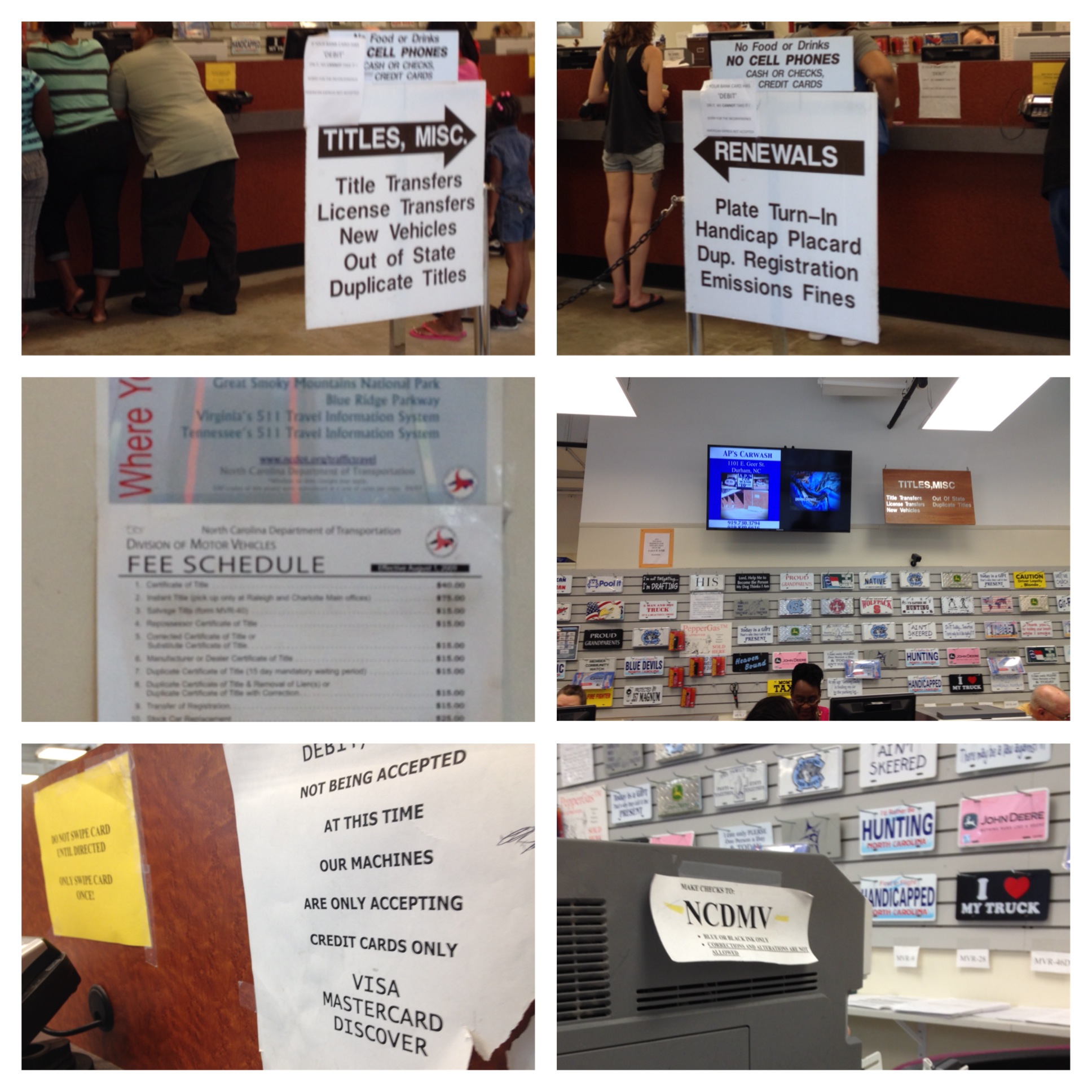
But I digress. My plainte de la journée (sorry, French teachers) for this visit centered around signage. Lots of signage. Everywhere-you-look signage. Confusing signage. Too much signage.
Had I taken the time to read it all, I would have known that I was supposed to have No Food or Drinks. I would have realized that DEBIT CARDS ARE NOT ACCEPTED. I would have seen that I needed to go left for Dup. Registration or right for Duplicate Titles (I’m sorry, didn’t you just duplicate that?).
The DMV is a visual wonderland of signs, signs, and more signs. New signs. Old signs. Faded signs. Torn signs. Misspelled signs. Signs with masking tape. Signs with Scotch tape. Signs upon signs upon signs.
Hey DMV: if you’re looking for a sign, I’ll give you one…SIMPLIFY.
Our churches run the same risk. It may be too much signage. It might be too many brochures on the information table. Or too many handouts in the welcome bag. Or too many options on the website, or…or…or…
Too much on the menu doesn’t reduce anxiety, it creates it. I walk into my local DMV and don’t know what to look at first. Because everything screams HEY I’M IMPORTANT LOOK AT ME, nothing is important. And so I still have to wait in line to talk to someone who’s been hired solely on their ability to growl, and direct my question to them.
Take a look around your facility. What do you see when you look at:
- Your front doors? Is the glass or wood covered in flyers, posters, or outdated event notices?
- Your guest bag? Do you include easy, understandable, achievable next steps? Or do you try to sign a guest up for a volunteer team on their first visit?
- Your information table? Is it covered with brochures for kids ministry, women’s ministry, the church softball league, and the local homeschoolers group? Does the material compete for quality (in other words, one brochure is professionally printed while another was designed by a volunteer with five minutes of word processing experience)?
- Your worship guide? Do the announcements on the guide match what’s being said on stage? Are you shoving every. last. thing that you can come up with in there? Do your guests really need to know what’s on the Wednesday night supper menu six weeks from now?
- Your stage / screen? If you use visual announcements, are they short? Relevant? Engaging? If you use a communicator for announcements, is he/she able to stick to a few main talking points and call for action?
Simplify. If it’s all important, nothing is important.
(If you’re looking for a couple of great books that go into fantastic detail on this subject, check out Less Clutter, Less Noise by my friend Kem Meyer, and Dangerous by my buddy Cleve Persinger, et al.)

Reblogged this on Coffee & Oatmeal.