How to Map Your Parking Lot, part 3: Signage and Cones

This is the third of a four-part series that gets into the weeds of how to set your parking lot up for success. We’re looking at mapping from zones to cones and people to placement, using a recent campus launch as a real-life example.
So far in this series, we’ve tackled which areas of the parking lot to use for which people and which entrances and exits to use for maximum efficiency. Today: how do our signs and cones get people to go where you want them?
Brace yourselves, kids: signage is one of the most expensive items you’ll ever purchase in Guest Services world. Way back in 2005 when I purchased signage for our first mobile site, I thought, “I’m just trying to buy some signs to put around this high school. I’m not trying to purchase the actual school.“
But good signage supports good systems, and good signage helps our people (although, as we’ve talked about before, People > Signage). So let’s talk about how to get the most bang for our big ol’ bucks.
Step 1: determine the best types of signs for your space.
Because this series is built off of a recent mobile campus launch, I’m choosing to focus on mobile signage…that stuff you can easily put down and pick up every week. (Don’t worry, nerds: we’ll do a post on permanent campus monument signage one of these days!)
At all of our campuses – permanent and portable – we typically use two types of signs rated for the great outdoors: a-frames and feather banners. These signs serve a directional purpose (turn here, park there, etc.) but also an advertising purpose. You might be surprised at the number of people who pass your church every day of the week and have no idea that you’re there. But when temporary and colorful signage goes up on the weekend, you stand out.
Depending on the footprint of the campus, we will usually use 6-10 feather banners to signal the main entrance and draw people there. We’ll also use any number of a-frames to point people towards specific zones, instruct them to turn on their hazard lights (to identify themselves as a first-time guest), or leave them with a missional blessing or value as they depart.
(Oh, and my preferred a-frame of choice is the Signicade Deluxe. In the past, we’ve used Displays2Go’s 13′ feather banner, though I’ll warn you: their turnaround time for that particular product is pretty abysmal. Order now and beat the rush for the next presidential election cycle (that joke works better if you realize that at the time of this writing, we’re 637 days away from the next election).)
Step 2: give each sign a spot, and each spot a purpose.
As I’m doing the initial walk through at a potential site (see step 1 of the first post in this series), I’m already thinking about the placement of signs and what each one needs to say. And typically, I’ll do a separate visit just focusing on signage, driving the lot multiple times to get a feel for what signs should go where.
For mobile campuses, I’m thinking about the space we’ll have on trailers to store signage, which means I have to whittle down what I might otherwise want. For portable or permanent, I have to remember that each additional sign takes additional time to set up. So the economy of money and minutes really does matter.
When thinking about “spots,” I’m thinking outside in: what will people see first? Which turns might be confusing? What heavy-traffic intersections should we take advantage of? What can we use to help guests self-identify? Once I move inside the lot, I’m thinking of signs to point people to specific parking areas: first-time guests, families with young kids, handicapped or special needs, etc.
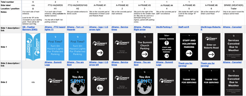
For our most recent campus launch, we landed on six feather banners and ten a-frames (with a standby “canceled for weather” a-frame because of our local school system’s snow policies). You can see the spreadsheet we created to keep up with signs needed below:

Step 3: remember the 45 mph rule.
Our graphic designer and I are now on year 14 of our fight over how much is too much to put on signs. He wants less, I want more. (And by the way, he always wins, because he’s absolutely right.)
We want people to be able to read signs quickly as they’re driving by. And you’ll notice on the layout above…our signs are all black except for a few in an eye-catching “Summit blue.” That color is reserved for our feather banners and our “hazard lights” signs. We especially want those to stand out because we know those particular signs are the ones we need our first-time guests to see.
Step 4: use cones to assure and secure.
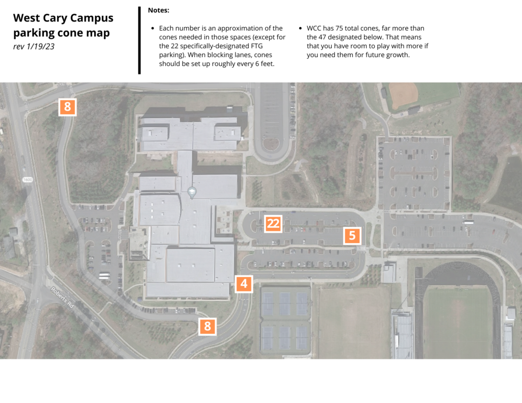
A good set of parking cones is one of the best utility players you can have on your team. We use cones to narrow our “entrance menu” (see post #2 in the series), to guide incoming and outgoing traffic, and to protect specific parking spaces for different types of guests.
The cones are also something I consider as I’m doing initial walkthroughs. For all campuses, I’m thinking about certain lanes, lots, or spaces that might need to be blocked, and how many cones it will take. For permanent campuses where we might utilize the lot for different things in the future (for example, a family night where we’re using one part of the lot for parking and another part of the lot for tables, a stage, inflatables, whatever), I want to purchase the amount of cones I’d need for a “max setting” in the future.
My cones of choice? I’m so glad you asked. After buying some real duds on Amazon through the years, I’m really happy with this 18″ model from Seton. The cones themselves are pretty economical (and incredibly sturdy / long lasting), but that shipping? Whoa Nellie. You might as well just drive to Buffalo to pick up those rascals.
Step 5: map it out and make it foolproof.
Once we know our signage and cone plans, we have to make sure that our set up, tear down, and parking teams knows the signage and cone plans. There are a few things we do to make it as easy-peasy as possible:
- Stencil the spot. I’ll use a 4.5″ high x 3.5″ wide stencil and fluorescent orange spray paint to mark an “A” (a-frame) or “B” (feather banner) to show exactly where the sign should go each week. (Though the stencils are unnoticeable if you’re not looking for them, always ask permission from your host facility before marking up their property!)
- Install a sleeve. Because our feather banners utilize a ground spike that has to be hammered in each week, at some campuses we’ve opted to insert a 3/4″ PVC pipe in the ground so the spike can just be dropped in.
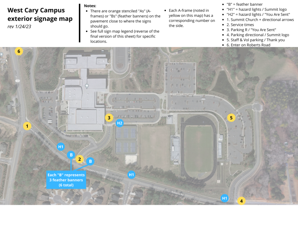
- Create a map. You know my love for maps. Here are the two we created for the most recent launch to detail signage and cone placement. The first map (exterior signage) has the spreadsheet from step 2 above printed on the back so that our set up teams know exactly which sign goes in exactly which spot.


Step 6: put it to the test.
One of my favorite quotes comes from German military strategist Helmuth von Moltke: “No battle plan survives contact with the enemy.“ We know that all of our plans leading up to launch have to be road tested after launch. I’m not the guy on the front lines; my set up and tear down and parking volunteers are. I’m not the guy coming in the main parking area each week; our guests are.
That means that we have to hold all of our planning and maps and signage with an open hand, watch traffic patterns and problems at launch, ask our volunteers for their feedback, and be willing to re-think, re-plan, and re-map as we go.
One great example from our recent launch: I mentioned in the last post that on launch day, we realized that Apple Maps directs all traffic into the back entrance, which takes people either to the bus lot or our trailer unload area. We scrambled the following week to get a new insert printed and a new a-frame ordered so that we could add “sign #6” on the map above, which directed all traffic around to the front.
Next up in the series: how many volunteers do you need, and where do you need them?
See all posts in the series:
- Part 1: Creating Zones
- Part 2: Ingress and Egress
- Part 3: Signage and Cones
- Part 4: People and Placements
