How to Map Your Parking Lot, part 2: Ingress and Egress

This is the second of a four-part series that gets into the weeds of how to set your parking lot up for success. We’re looking at mapping from zones to cones and people to placement, using a recent campus launch as a real-life example.
Today we’re discussing ingress and egress.
Editor’s note: aren’t ingress and egress just fancy terms for entrance and exit, and aren’t you just using them to make yourself sound smarter than you actually are, and didn’t you, in fact, just Google “What is the difference between ingress and egress?” just to make sure you were using them correctly?
Sorry, I’m driving through a tunnel and I can’t hea…[static noise].
Whether you want to wow or annoy your parking team volunteers with your fancy blog learnin’, or whether you are just trying to figure out how to get all the cars in your lot to arrive and leave without smacking into one another, you need to think about your guests’ entry and exit before they have to think about it.
Going back to our first post in the series, you’ve already determined who goes where and what kind of space you need. For the purposes of this post, we’re going to focus on the main lot: that one where your first-time guests and general parking will be housed. (Obviously, if you only have one lot, everything below applies to you as well.)
Step 1: narrow your “entrance menu.”
In my ideal world, every church parking lot would have one way in and one way out. But few of us live in an ideal world. Many of us inherited parking lots that have access from multiple sides. And with multiple entrances comes the need to manage multiple entrances.
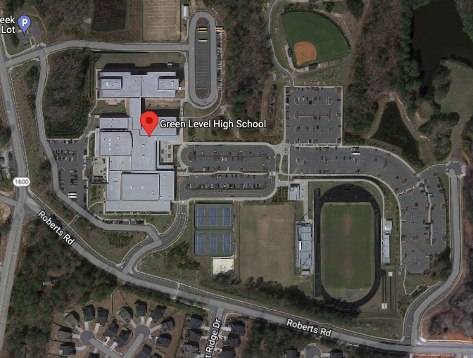
Going back to our most recent campus launch as an example, there are three entrances to the high school we’re using. We realized on launch day that Apple Maps points you to the back bus lot, while the other major maps apps take you to the main entrance. But there’s also a secondary students lot, which we utilize for staff and volunteer parking (because it’s inconvenient, and we both choose inconvenience and choose to walk).

So we chose to funnel all first-time guest and general traffic away from those other two entrances and towards the main entrance. We do that through signage and cones and volunteers (more on that in the remainder of this series), and we do that because it helps us to shape our guest’s experience.
[related post: What Do You Want Your Guests to See?]
Step 2: consider scheduled access parking for multiple services.
If you only have one service, skip to step 3. But multiple services lead to multiple opportunities for confusion or clarity. We chose clarity, and because of that we chose a “scheduled access” plan, which means that we fill certain spaces at certain times. See more in this post, where I cover the scheduled access idea in excruciating detail.
Step 3: prevent cross-traffic flow.
Whether or not we’re using scheduled access parking, we know that the flow of traffic at high-volume times matters, and managing it inefficiently means traffic backups, starting your services late, and even fender benders.
Turning left into oncoming traffic is both dangerous and inefficient (something UPS has demonstrated with remarkable data, leading to their “right turn only” policy 90% of the time).
So when it comes to entering our main lot or turning while inside the lot, we want to do all we can to maintain one direction (not One Direction, though we can all admit we still miss Zayn). We want to keep the lot itself (and any subsections inside the lot) as one way in, one way out.
Step 4: map it out and try it out.
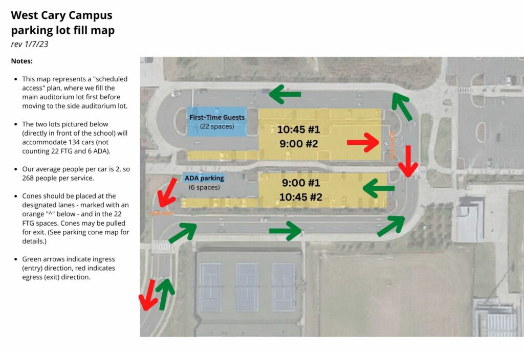
This is all fine in theory. But eventually we have to diagram it so volunteers (and maybe attendees) will be able to see it, process it, and put it into practice. Here’s our map from the most recent launch:

In this layout, you can see that we have an initial lot for each service. We fill the lower lot first at 9:00 a.m., then move to the upper lot when it hits capacity. We reverse the plan for 10:45 a.m. Regardless of the service, we have specific spots for First-Time Guest and ADA parking.
You can see that the green arrows are ingress, the red are egress, and we’ve designed it so there’s as little cross-traffic flow as possible. 9:00 traffic is always exiting straight ahead or to the right as 10:45 traffic is entering, so it prevents backups. Going back to the UPS example above, left turns can add 30 to 45 seconds per car. (I’d say in the church world, it’s more like 120 seconds, because ain’t nobody gonna turn left and get in between a Baptist and a buffet.)
And by the way, you may be wondering how the “right turn only” works when you’re leaving a church parking lot and turning onto a public street. We always defer to our local law enforcement on this, as well as the practical nature of the surrounding roads. Some of our campuses are on slower side roads where we can temporarily stop cross traffic and let people out. Some are at the mercy of traffic lights. But wherever we can and wherever it’s practical, we encourage right turn only out of parking lots.
Next up in the series: how to determine the number and placement of signage and traffic cones
See all posts in the series:
- Part 1: Creating Zones
- Part 2: Ingress and Egress
- Part 3: Signage and Cones
- Part 4: People and Placements
