Days of Signs and Wanders

In a recent post we talked about the irony that a $25 billion global brand has failed – in at least a couple of occasions – to invest in a hundred buck sign.
Today, let’s narrow that focus to the context of the local church. Perhaps you have done a great job of investing in adequate signage for your facility. It’s clear, it’s visible, and it’s practical in both form and function. But there’s an often-overlooked principle in our way-finding efforts, and it’s this:
Some signs have to pair with people.
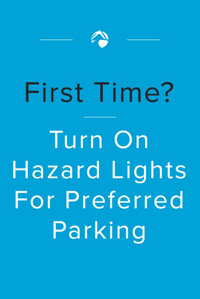
Take, for example, a standard sign that we have at all of our Summit campuses. Our “hazards” sign (pictured below) is the catalyst that starts the chain reaction of our first-time guest process. If someone doesn’t hit their hazard lights, we don’t have a foolproof way of knowing they’re new and offering extra help.

And these signs are simply fantastic. This small investment has resulted in thousands of our first timers getting a jump-start on conversations and connections, being led to reserved parking right by the front door, and being engaged by volunteers who want to make their first experience a great experience. These signs just work.
Except when they don’t.
Here’s some feedback from one of our first-time guests who followed our instructions:
There was a sign for us to turn on our hazard lights to be directed to a parking spot but there was no one present to do so.
Ouch.
Our best laid plans were laid waste for lack of a person. Our best signs led to both wondering and wandering. It did our guest no good to give us a literal signal if there wasn’t a volunteer to interpret that signal. Because we didn’t have a skeleton crew in place that day, a guest was left feeling frustrated instead of connected.
Think for a moment about areas where you have signs that must pair with people:
- At your information table. Do you have a sign that says “Ask me!” but there’s no one there to ask?
- In your kids entry lobby. Do you have a sign that says “Please see a volunteer to check in” but there’s no volunteer there?
- On your pre-service slides. Does an announcement push you to a kiosk in the lobby, but the kiosk is unstaffed?
Signs are great. People are great. but sometimes, they have to come in pairs.
Related posts (read these, too!):

1 Response
[…] of a first-time guest, you don’t want a code that’s difficult to crack. Your signage and on-ramps should be clear and obvious. The visual cues and prompts from the stage should all […]